Text prediction analysis charts
Learn how to understand the performance charts on the Analysis tab of a text prediction. Monitoring predictions is a source of valuable information about the messages that come through your conversational channels.
Use these insights to address the needs of your customers, for example, by reacting to a spike in support requests. Find out how you can improve your prediction to get more accurate results.
Overview
The Overview tab contains the following charts:
- Prediction calls
- This chart shows how many times over the selected time frame the prediction analyzed text in the selected languages. The x-axis shows the dates on which prediction calls were made, for example, the last seven days. The y-axis shows the prediction call counts for different languages. When you hover over a date, you see how many times the prediction analyzed each language.
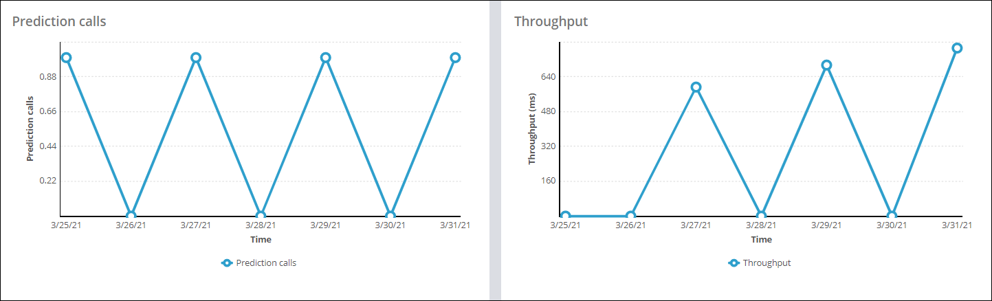
- Throughput
- This chart shows the average execution time of a prediction run (throughput) for all prediction runs over the selected time frame and for the selected languages. The x-axis shows the dates for the selected time frame. The y-axis shows the throughput time in milliseconds. Each line in the chart represents a prediction language.
- Most frequent topics
- This chart shows the ten most frequent topics. Each bar on the y-axis represents one of the topics. The x-axis shows the topic count. The blue part of a bar shows the number of times that the prediction detected the topic (success count). The green part of a bar shows the number of times that feedback is given for the topic (error count). The bars are sorted from top to bottom based on the highest error-to-success ratio.
- Top entities
- This chart shows up to the ten most frequent entities that the prediction detected over the specified period. The x-axis shows the number of entities. Each bar on the y-axis represents one of the entities. The bars are sorted from top to bottom based on the highest entity counts.
- Sentiment distribution
- This pie chart shows the aggregated number of times that the prediction detected each sentiment over the specified period. The slices of the pie correspond to the three sentiments: positive, negative, and neutral.
- Average number of words
- This chart shows the average number of words in the text that the prediction
analyzed for the selected languages over the specified period. The number of
words equals the number of tokens in the text. For example, in the text
I want a home loan.
, the number of words is 6 (punctuation marks are also tokens).
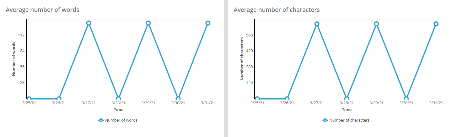
- Average number of characters
- This chart shows the average number of characters (document size) for the
text that the prediction analyzed for the selected languages over the
specified period. The number of characters is calculated by using the
text.length()query. For example, in the textI want a home loan.
, the number of characters is 19.
Topics
The Topics tab contains the following charts:
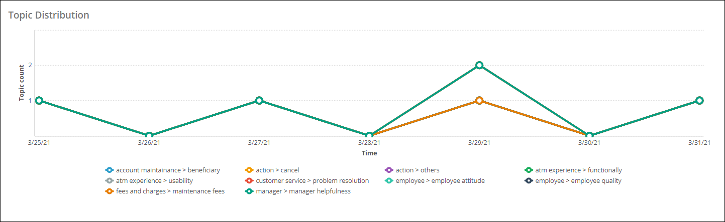
- Topic distribution
- This chart shows the topic distribution over the specified period. The x-axis shows the dates for the selected time frame. The y-axis shows the topic count. The lines in the chart correspond to the top ten most frequent topics.
- Topic feedback distribution
- This chart shows topic feedback distribution over the specified period. The x-axis shows the dates for the selected time frame. The y-axis represents the number of times that the prediction received feedback for a topic (feedback count). The lines in the chart correspond to the top ten topics with most feedback in that time frame.
- Topic error rate
- This chart shows the topic error rate over the specified period. The y-axis
represents the error rate, which is calculated as (error count/topic count)
* 100. The x-axis shows the dates for the selected time frame. The lines in
the chart correspond to the top ten topics with the most errors in that time
frame. When feedback is given for a topic and the feedback topic and the
detected topic are not the same, then an error for that detected topic is
recorded. If the feedback topic and the detected topic are the same, then no
error is recorded, and only the feedback count is updated. The following
table shows an example of when errors are recorded:
Detected topic Feedback topic Topic for which an error is recorded Action > homeloan Action > changeAddress Action > homeloan Action > homeloan None Action > homeloan Action > homeloan Action > homeloan None None Action > changeAddress Action > changeAddress - Most frequent topics
- This chart shows the ten most frequent topics. Each bar on the y-axis represents one of the topics. The x-axis shows the topic count. The blue part of a bar shows the number of times that the prediction detected the topic (success count). The green part of a bar shows the number of times that feedback is given for the topic (error count). The bars are sorted from top to bottom based on the highest error-to-success ratio.

- Topics with highest percentage errors
- This chart shows the ten topics with the highest percentage of errors. The x-axis represents the count of topics. The y-axis shows bars that represent the topics. The blue part of a bar shows the number of times that the prediction detected the topic (success count). The green part of a bar shows the number of times that feedback is given to the topic (error count). The bars are sorted from top to bottom based on the highest error-to-success ratio.
Sentiments
The Sentiments tab contains the following charts:
- Sentiment over time
- This chart shows the sentiment distribution over the specified period. The x-axis shows the dates for the selected time frame. The y-axis shows the number of times that the prediction detected a particular sentiment. The lines in the chart correspond to the three sentiments: positive, negative, and neutral.
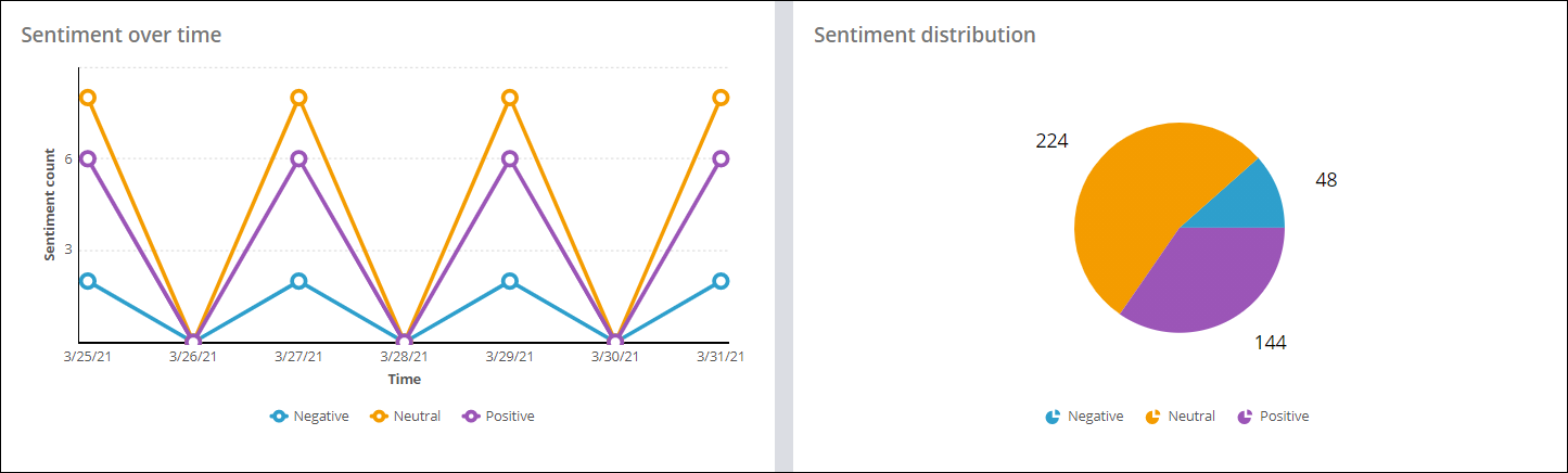
- Sentiment distribution
- This pie chart shows the aggregated number of times that the prediction detected each sentiment over the specified period. The slices of the pie correspond to the three sentiments: positive, negative, and neutral.
- Sentiment feedback distribution
- This chart shows the sentiment feedback distribution across the specified period. The x-axis shows the dates for the selected time frame. The y-axis represents the number of times that the prediction received feedback for a sentiment (feedback count). The lines in the chart correspond to the three sentiments: positive, negative, and neutral.
- Sentiment error rate
- This chart shows the sentiment error rate over the specified period. The
y-axis represents the error rate that is calculated by (error
count/sentiment count) * 100. The x-axis shows the dates for the selected
time frame. The lines in the chart correspond to the three sentiments:
positive, negative, and neutral. When feedback is given for a sentiment and
the feedback sentiment and the detected sentiment are not the same, then an
error for that detected sentiment is recorded. If the feedback sentiment and
the detected sentiment are the same, then no error is recorded, only the
feedback count updated. The following table is an example that shows when
errors are recorded:
Detected sentiment Feedback sentiment Sentiment for which an error is recorded Positive Negative Positive Positive Positive None
Entities
The Entities tab contains the following charts:
- Entity distribution
- This chart shows the entity distribution over the specified period. The x-axis shows the dates for the selected time frame. The y-axis represents the number of times that the prediction detected a particular entity. The lines in the chart correspond to the top ten frequent entities over that time frame.
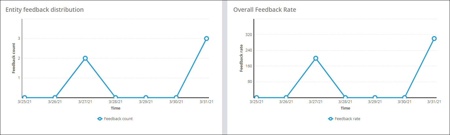
- Entity feedback distribution
- This chart shows entity feedback distribution over the specified period. The x-axis shows the dates for the selected time frame. The y-axis shows the number of text prediction runs that received feedback for entity outcomes. If feedback is recorded for one or more entities that were detected by a single text prediction run, the feedback count for that run is 1.
- Overall feedback rate
- This chart shows the overall feedback rate over the specified period. The x-axis shows the dates for the selected time frame. The y-axis represents the feedback rate that is calculated as (feedback count/prediction count) * 100. The prediction count is the number of prediction calls with entity detection selected.
- Top entities
- This chart shows up to the ten most frequent entities that the prediction detected over the specified period. The x-axis shows the number of entities. Each bar on the y-axis represents one of the entities. The bars are sorted from top to bottom based on the highest entity counts.
Previous topic Monitoring text predictions Next topic Parsing emails