How to add custom tab formats to your application skin
This article describes how to create custom tab formats in the Skin rule and apply them in your application. For more information on using the Skin rule, see How to create a Skin rule and define Style Presets.
Suggested Approach
The Skin rule contains three tab formats: Standard, Sub, and Repeating. You can modify these formats, specifying text, border, and background values for the tab header and border, background, and padding values for the tab body.
In addition, you can create custom tab formats in the Skin rule. You can also create custom formats for grids, smart layouts, buttons, and links in the Skin rule. Styling these elements and formats within the Skin rule, rather than in the application itself, maximizes re-use and minimizes maintenance. A change in the Skin rule cascades throughout the application automatically.
This article describes how to create custom tab formats in the Skin rule and apply them to section tabs in your application.
To interact with a sample, select >
>  >
>  , and select Tab in the Container group.
Creating custom tab formats in the Skin rule
- Open the appropriate application Skin rule. Select > >
 to view all the portals used by and defined in the current application, as well as their associated skins. Click the Skin name in the Portal tab, or double-click the Skin name in the Skins tab to open the skin.
 - On the Styles tab of the Skin rule, select Layouts >Tabs.
- Click
 to add a new custom tab format.
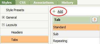
- A text input box displays. Type the custom style name using only alpha-numeric characters (a-z and 0-9) and spaces. The style name cannot begin with a number. The style name that you enter is converted into the name CSS class/classes.
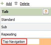
You can delete tab formats that you create; click . You cannot delete the three standard tab formats: Standard, Sub, and Repeating.
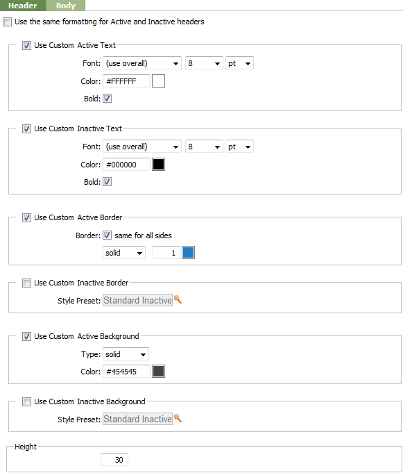
 - Specify the values for the new custom format, using Style Presets when appropriate. A style preset is a style that you set in a single location and then apply to multiple elements in the skin rule. In this example, the background of the active tab header is dark gray, the text is white, and the border is blue. Inactive tab header text is black and the background and border are determined by the Standard Inactive Style Preset.
- Save the skin rule.
- In the toolbar, click Run
 to preview the skin.
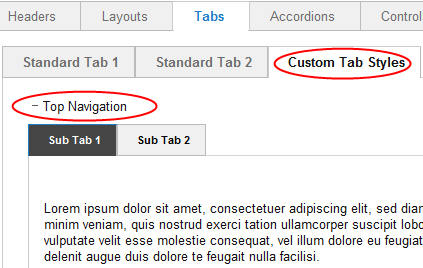
 - In the Skin Preview, click Tabs, and then click Custom Tab Styles.
- Select the custom tab style you want to preview, in this case, Top Navigation.
Applying a custom tab format to a layout
Make sure your application is using the Skin containing the custom tab format.
You can run an application in a skin by referencing the skin rule in the Run process in group of the General Preferences in the Designer Studio. The skin you reference in General Preferences is used when running flows, creating work objects and testing and previewing the application. It overrides a skin specified in the portal.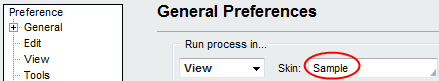
To apply a custom tab format to a layout:
- Open the section in which you want to add a tab group that uses the custom tab format.
- Add a tab group to the layout.
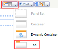
- Click
 to open the Tab Group panel.
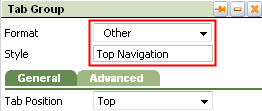
- Select Other as the Format and type the name of the custom tab format that you want to use in the Style field, in this case, Top Navigation.
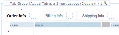
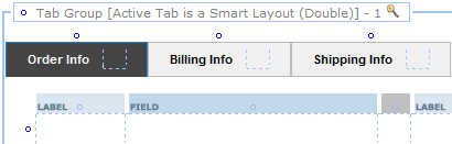
- The tab layout reflects the custom format:
- Save the rule.
Additional Information
You can create custom formats for grids, smart layouts, buttons, and links in the Skin rule. See the Developer Help for details.
How to add tabbed header layouts to sections or harnesses
How to create a Skin rule and define Style Presets
How to include a property value in a layout tab
How to use the Skin rule to modify the appearance of your application