How to use Skin rules to modify the appearance of your application
There are many ways that you can use the Skin rule to modify the appearance of your application user interface.
The Skin rule is designed to enable reuse and cascading change throughout your application Skin. This article demonstrates how to modify an existing Skin rule to change the appearance of the standard Case Manager portal and associated work item forms.
For more information on using the Skin rule, see How to create a Skin rule and define Style Presets.
Suggested Approach
Examine the standard Case Manager portal and proposed branding changes. Modify the Skin rule to to implement branding changes in the standard Case Manager portal and associated work item forms.
Modifying the Appearance of the Case Manager Portal
The standard Case Manager portal, using the EndUser62 skin, appears as follows: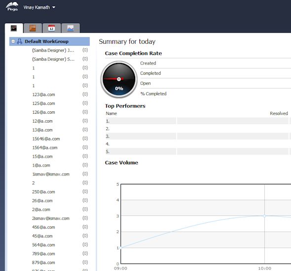
While this standard branding may be just right for your organization, there may be cases in which you want to modify the branding of the Case Manager portal to reflect the color scheme, font, or other stylistic elements of your application.
For example, your organization may brand the Case Manager portal as follows, using a light gray background and blue underline in the portal header, and a different font and page color, among other differences: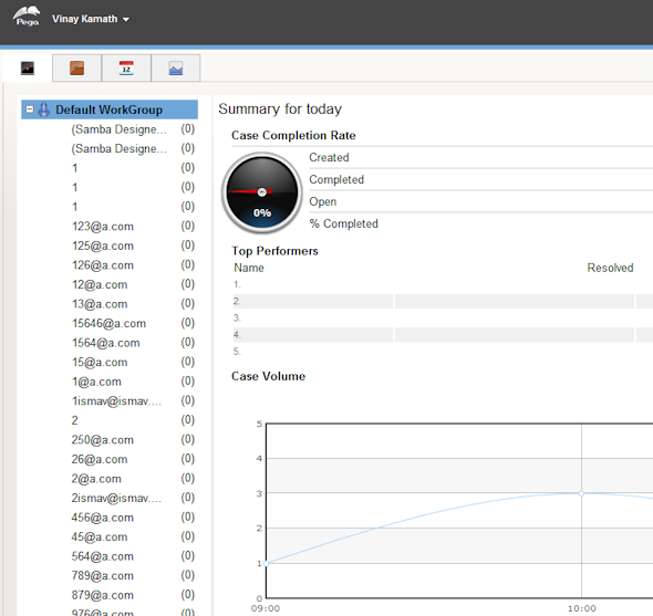
Differences between the appearance of the standard Case Manager portal and the proposed branding shown above include:
- a different color for the top panel and the center panel
- blue bottom border on the top panel
- different document (UI Page) background color (the area indicated by the red arrows in the image above)
- less padding in the center panel (notice the space between the left edge of the screen to where the left edge of the first tab)
- color of the padding area of the center panel is the same as the gaps between the containers of the center panel
- different font type and size in the center panel
To implement these changes, update styles for the following in the Skin rule:
Panel Set
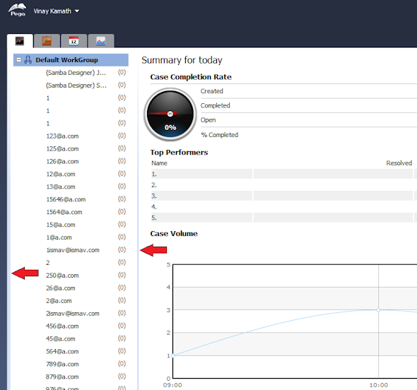
The Case Manager Portal is comprised of two panels, both of which have a document (the UI Page). The document (or UI Page) can be styled independently of the portal. In the case of the Case Manager Portal, the center panel document is visible in the gaps between the containers of the center panel, indicated by the red arrows below. The color on the Page is shown by the Red arrows. The styling on the Page shows up through the spaces in the containers of the center panel.
To modify the branding of the Panel Set:
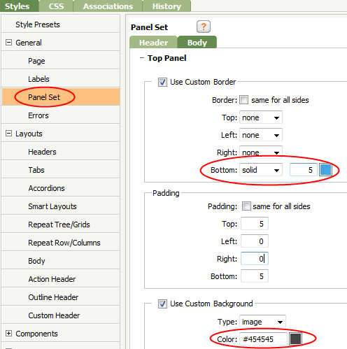
- Open the Skin rule and select Styles.
- On the Styles tab, select General > Panel Set.
- Select the Body tab and then select Top Panel.
- Set the Bottom border as solid light blue with a width of 5 pixels.
- Set the Background to solid gray, as shown:
- Select Center Panel and set the Padding to 5 px for all sides.
- Set the Background to
none. This defines the background of the center panel as transparent, meaning the the color set on the document (UI Page) shows through the transparent areas of the center panel.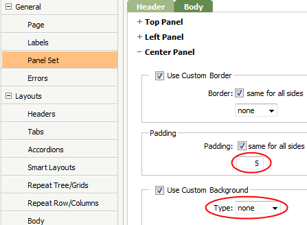
Page
The Page color in the standard Case Manager portal, set by the EndUser62 skin, is light blue. To implement the new branding, set the page color to #EDEAE3.
- On the Styles tab, select General > Page.
- Set the Background color to
#EDEAE3. This is the same color that displays in the transparent areas of the center panel of the portal.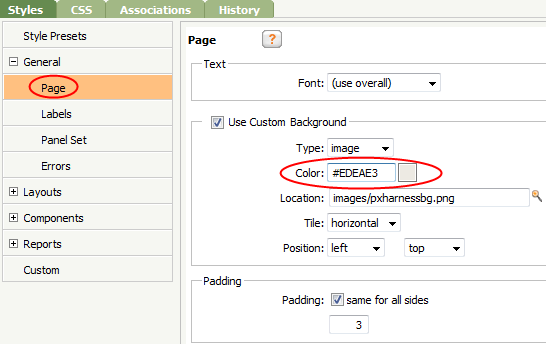
Overall Font
The new design requires Arial, 12 point font. To make this change, first set the Overall Font and then create a Style Preset that defines the font size and color. The font that you select as the Overall Font is the default font for all Style Presets. A Style Preset is a reusable setting or group of settings that describes style and presentation. You define Style Presets in the Skin rule and then apply them to multiple elements or components in the Skin.
As best practice, use the Overall Font in all Style Presets and individual element styling. Using Style Presets that reference the Overall Font throughout your application skin helps to ensure a single font across your UI and enables you to change the font in a skin in a single location. For more information about working with Style Presets, see How to create a Skin rule and define Style Presets.
To set the Overall Font and specify the font size and color:
- On the Styles tab, select Style Presets.
- At the top of the page, change the Overall Font to
Arial.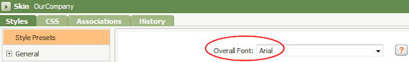
- Select the
Standard ActiveStyle Preset and set the font size to 13 pixels.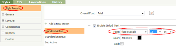
Modifying the Appearance of a Work Item Form
You may choose to re-brand work items forms in a similar fashion. For example, a work item appears as follows using the standard (out-of-the-box) EndUser62 skin: 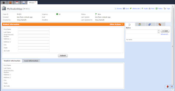
However, your organization may want to display a work item as follows:
In addition to the background color, some of the differences between the presentation of these two work items are:
- Larger label font and size
- Space allocated for label and field
- Action area header and font
- Border around the Action area
- Button color and style (Submit button)
To implement these changes, update styles for the following in the Skin rule:
Note: The Font type, size, and Page background do no need to be modified; they were updated when applying changes to the portal branding in the steps above.
Label Font and Size and Label-Field Spacing
No change is required to update the Label font and size; we made these changes when updating the portal styling in the steps above. We changed the Overall Font for the skin to Arial. Since the Overall Font is the default font for all Style Presets, and Style Presets determine the presentation of UI elements, a change in the Overall Font cascades throughout the application skin. We set the font size in the Standard Active Style Preset. Since Labels use the Standard Active Style Preset to define text appearance, no additional change is necessary.
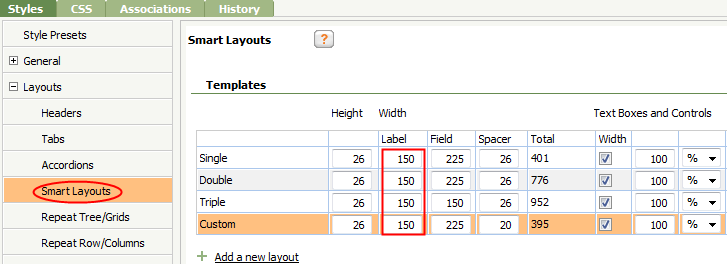
However, since we increased the font size from 8 px, in original the EndUser62 skin, to 13 px, we need to adjust the label-field spacing in the Smart Layout to ensure that the label text does not wrap.
To do this:
- On the Styles tab, select Layouts > Smart Layouts.
- Select the Body tab and then select Top Panel.
- Set the Label Width to 150 for all four column layouts. This setting allocates more space for the label in the smart layout forms. You may want to adjust the Height of the label and the Spacer between the label and the field:
Action Header
Create a Style Preset to apply to the action header and to additional headers within the application skin. This is a best practice recommendation — specify styles that are used more than once in a Style Preset.
To create a Style Preset for headers:
- On the Styles tab, select Style Presets.
- Click
 and type a name for the Style Preset:
Header. - Define the
HeaderStyle Preset with a solid gray background, border and bold white text, as shown: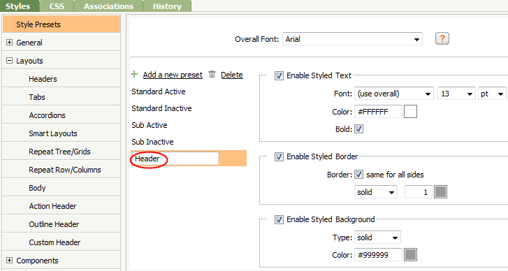
- On the Styles tab, select Layouts > Action Header.
- Select the Header tab and set the Text, Border, and Background to reference the
HeaderStyle Preset.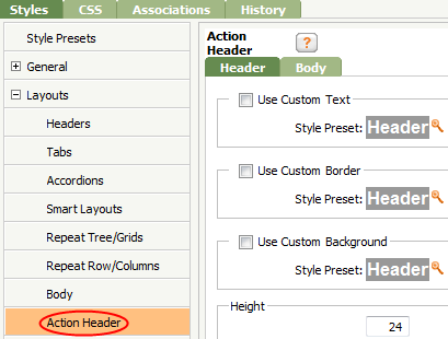
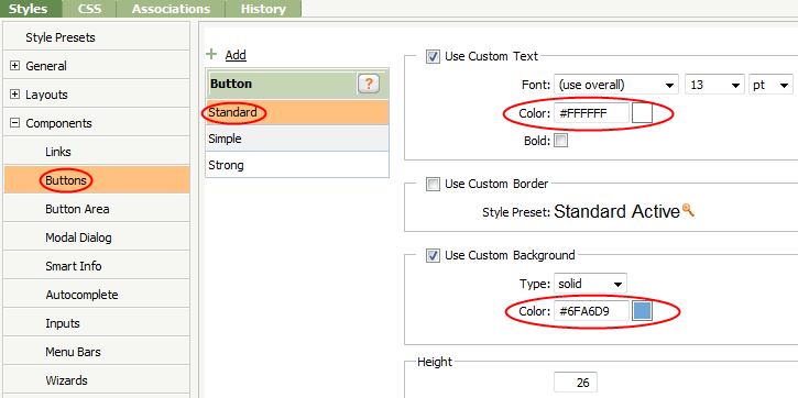
Button
Notice that new branding calls for buttons with a blue background and white text, rather than the gray background and black text specified in the EndUser62 skin. To effect these changes:
- On the Styles tab, select Components > Buttons.
- Define the Standard button style with a blue background and a white text color, as shown:
The Skin provides many ways to modify the appearance of your application user interface. To make changes to the appearance of user interface fast and easy to implement, use Style Presets whenever possible.