Charts and Reporting: What's New in Pega 7
 | Developers and end users can take advantage of new chart and reporting features to support active analytics and data visualization. User managers and business analysts can visually analyze activity, progress, and changes in their business processes. |
More charts and reporting options enhance visualizing data.
Pega 7 lets you choose from over three dozen chart types and subtypes, including pie, bar, column, line, area, bubble, gauge, funnel, pyramid, and combo charts, plus hundreds of different maps. You can provide map-to-map drilldowns. New chart formatting options include custom color palettes for coloring chart elements, conditional coloring of chart elements, and color thresholds. | 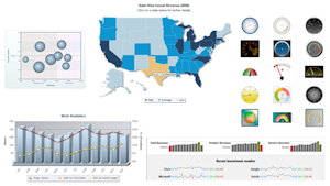 |
Redesigned and restyled interfaces empower working with charts and reports.
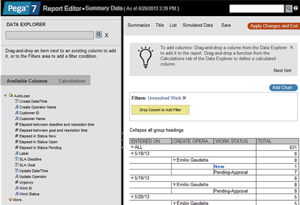 | Styling and usability enhancements make the Report Viewer, Report Editor, and Chart Editor more intuitive and easier to learn and use. Users can now style the editors using the Designer Studio and Case Manager skins. Revised toolbars provide more intuitive access to commands. Hints dynamically appear when you select commands. The Preview pane of the Chart Editor updates immediately to show the effect of changes you make. Reports themselves are easier to read. Report headers do not scroll, and summary reports have been completely reformatted to be easier to review. Note: If you have created custom skins for earlier versions of the Report Editor and Report Viewer, reports may not appear as you expect them to in Pega 7. To fix the issue, see Updating skins in Reporting. |