How to add a menu bar to a composite portal
Summary
The structure and function of a menu bar is determined by an XML Stream rule.
In this example, a menu bar allows users to switch between two spaces of a composite portal, and to open a New Work form.
Update: In V6.1+, as a best practice, create a menu bar using a navigation rule, rather than through hand-coded XML. See How to create a menu bar using a navigation rule.
Suggested Approach
The MenuBar control rule uses an XML Stream rule to define the structure of a menu bar and the functions that each selected menu item executes. In a composite portal, styles and HTML parameter settings control the appearance of the menu. See Related Topics below for links to other articles about composite portals.
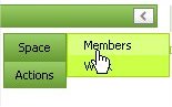
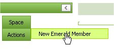
In this example, a simple menu offers users of the Emerald Club Membership Tracking application two top-level choices: Space and Actions. The Space submenu allows users to switch between two portal spaces — a Members space that helps them look up existing club members, and a Work space that allows them to start a workflow to enroll a new member:
 |  |
Step 1: Create an XML Stream rule
Create an XML Stream rule with the third key part — the XML Type — set to "Menu". The other two key parts must be valid, but are arbitrary choice.
On the XML tab, clear the Auto-generated? check box. This allows you to enter an XML document directly, or use open authoring with Windows NotePad or an XML editor.
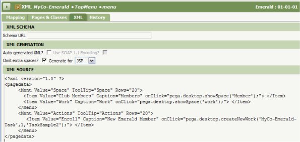
This XML stream rule contains the following document, defining the menu items shown above.
- The showSpace( ) JavaScript API function perform space switching.
- The createNewWork( ) JavaScript API function opens a New harness for a specified starter flow rule.
(Additional functions are in the standard text file rule named webwb.menuactionhandlers.js though some features of these functions are not available for the MenuBar control rule. Within a custom JavaScript function, you can call the pega.desktop.getCurrentSpaceName() function to return the name of the current space.)
<?xml version="1.0" ?>
<pagedata>
<Menu Value="Space" ToolTip="Space" Rows="20">
<Item Value="Club Members" Caption="Members" onClick="pega.desktop.showSpace('Member');"> </Item>
<Item Value="Work" Caption="Work" onClick="pega.desktop.showSpace('work');">
</Item>
</Menu>
<Menu Value="Actions" ToolTip="Actions" Rows="20">
<Item Value="Enroll" Caption="New Emerald Member"onClick="pega.desktop.createNewWork('MyCo-Emerald-Task',1,'TaskSample2');"> </Item>
</Menu>
</pagedata>
Step 2: Reference the XML Stream rule in a menu bar section
1. Create a section rule to hold the menu. By convention, the Applies To class of section rules to be referenced in composite portals is Data-Portal, though this is not required.
You can adjust the dimensions of the section later to fit the menu and fit within panels of the harness rules that make up each portal space. You can present top-level menus horizontally (with submenus below, as in the Developer portal) or vertically, as in this example.
2. Create a freeform layout on the section containing a single cell.
3. Select and drag the Menu Bar control  into the cell and drop it.
4. Click the magnifying glass icon at the right of the cell to open the Cell Properties panel.
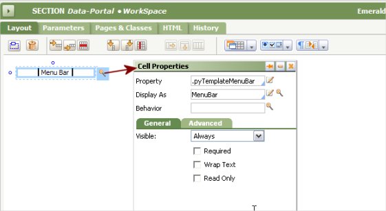
5. Click the magnifying glass icon at the right of the Display As field to access HTML Property parameters for the MenuBar control rule.
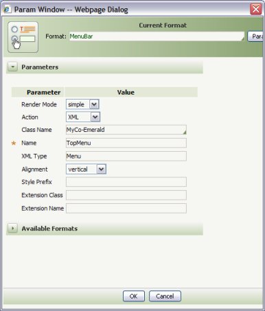
Identify the XML Stream rule you created in Step 1 above through the three key parts: Class Name, Name, and XML Type. Select XML as the action. Click OK.
Step 3: Reference the section in a panel in each harness rule of the composite portal
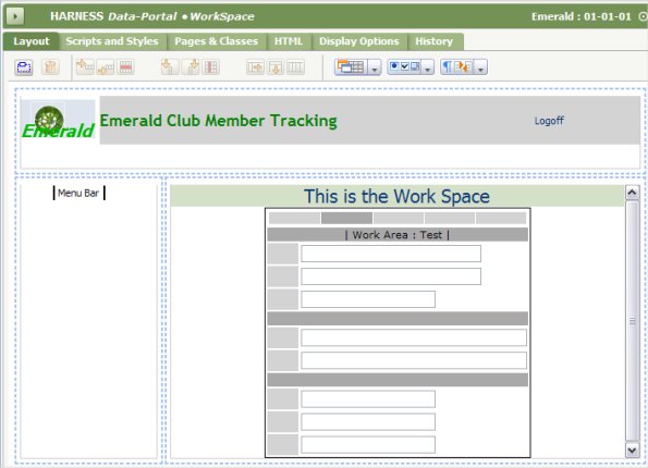
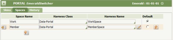
In this example, the harness rule named Data-Portal.WorkSpace defines the content of a space named Work. This harness rule contains three panels: Top, Left, and Center. The Left panel references the section identified in step 2 above.
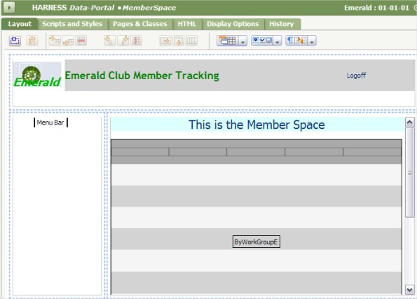
The second space Members is defined by a harness rule named Data-Portal.MemberSpace. Like the first harness rule, this has three panels. The contents of the Top and Left panel are the same as for the Work space.
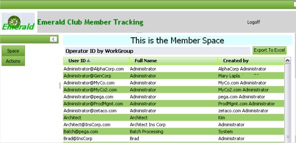
The section in the right panel includes an embedded list view control to support a report display of Emerald Club members. (In this example, a placeholder report of operators-by-work-group appears.)
The portal rule references each space and identifies the Work as the default, as indicated by a radio button setting.
Step 4: Test and evolve
1. For thorough testing, do not open the composite portal as a secondary portal from your own (Developer) portal. Instead, create an operator ID associated with a dedicated access group that provides access to the composite portal.
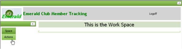
2. Log in as an application user with the new Operator ID. The menu appears in the Left panel, as expected. The Work Space is empty.
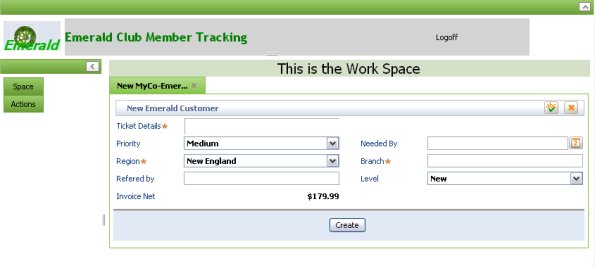
3. Select the Actions > New Emerald Member menu option. The New work harness associated with the starter flow appears.
4. Select the Space > Members menu option to switch to the Member space. The list view report appears within the member space.