Mobile Messaging SDK configuration in your Android app project
Integrate Mobile Messaging SDK with your Android app by using Fragments (recommended)
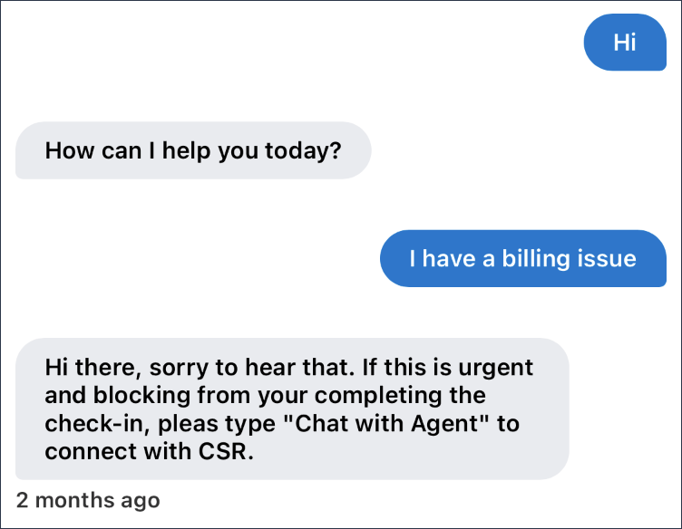
and Views. To integrate Mobile Messaging SDK with your Android app, perform the following steps: The following line needs to be included in application
configuration: Mobile Messaging SDK provides an abstract fragment class
Add the following Java code to your Android project to implement server
configuration and authentication: The following Java code shows the activity implementation in Views, which also
requires server configuration and authentication: In your Java code, ensure that you provide values for the apiURL and
apiId variables based on what the system generated in step 5a in the
Creating an Android app connection section. You can customize the chat view by overriding Chat.Theme and
specifying new values for the defined attributes. You can find the available
attributes in the tables at the end of this section. The following figure illustrates the common attributes for messages, such as text
size, margins, message background, font family, and other attributes mentioned
in the table. End margin for received and start margin for sent
messages The following figure illustrates the attributes of the image messages, such
as maximum image height and image shape: The following figure illustrates the attributes of document attachments, such
as attachment name font family, attachment description, text size, and other
attributes mentioned in the following table: The following figure illustrates the attributes of a menu, such as menu item
font family, menu item text size, text color of the menu item, and other
attributes mentioned in the following table: The following figure illustrates the attributes of a link button, such as
font family, text size, and other attributes explained in the following
table: The following table shows the attributes of a floating action button, such as
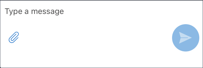
font family, button text, text size, and other attributes: The following figure illustrates the attributes of the input text area where
the CSR types the message and sends it to the user. The attributes in the
following table are of the input text area: The following figure illustrates the attributes of the selected attachments in
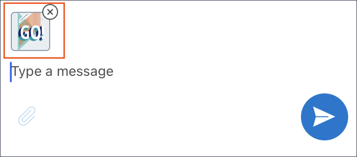
the Web Messaging: The following table displays the attributes of the attachments that the user can
select: You can customize or translate the strings used in the chat by overriding the defined
strings. Number of arguments must remain same. You can update the When customers can no longer see the chat in an app, and they receive a new message
with the You can use the Intent.newMessage() extension method to obtain a
new message in an instance of the NewMessage class, as shown in
the following Java code: Pega Mobile
Messaging SDK provides you with the following methods and callbacks for your Android
app in the 8.7.2 version.
Android Implementation Android Implementation Android Implementation Android Implementation Android ImplementationManual installation of Mobile Messaging SDK
build.gradle.kts file.
dependencies {
 ... implementation("com.pega.dm.mobile.chatsdk:chatsdk:1.0.3")
... } android {
...
buildFeatures {
...
dataBinding = true
...
}
...
}android {
...
compileOptions {
...
coreLibraryDesugaringEnabled = true
sourceCompatibility = JavaVersion.VERSION_1_8
targetCompatibility = JavaVersion.VERSION_1_8
...
}
...
}
...
dependencies {
...
coreLibraryDesugaring("com.android.tools:desugar_jdk_libs:1.1.5")
...
} build.gradle.kts file, add the following
code:allprojects {
repositories {
maven(url = “/full/path/to/MobileMessagingSDK-Android-v1.0.3”)
...
} Implementation using Fragments
com.pega.dm.mobile.chatsdk.fragment.ChatFragment, which you can
implement and use as a standard Android fragment. Implementation
 import com.pega.dm.mobile.chatsdk.ChatConfiguration
 import com.pega.dm.mobile.chatsdk.fragment.ChatFragment
 class MyChatFragment : ChatFragment()
 {
  override fun configuration() = ChatConfiguration
  (
   apiUrl = "...",
   apiId = "...",
   customerToken = "...",
   authToken =
  {
   it: Application -> /* Obtain authentication token */ token } )
}
Implementation using Views
Mobile Messaging SDK provides the
com.pega.dm.mobile.chatsdk.widget.ChatView class which you can
use as a standard Android view. To use this view, call the
ChatView.onCreate method as soon as possible, for example, in
the onCreate method for Activities or
onViewCreated for Fragments.
<androidx.constraintlayout.widget.ConstraintLayout
xmlns:android="http://schemas.android.com/apk/res/android"
xmlns:app="http://schemas.android.com/apk/res-auto"
xmlns:tools="http://schemas.android.com/tools"
android:layout_width="match_parent"
android:layout_height="match_parent"
tools:context=".MainActivity" >

<com.pega.dm.mobile.chatsdk.widget.ChatView
android:id="@+id/chat"
app:layout_constraintTop_toTopOf="parent"
app:layout_constraintBottom_toBottomOf="parent"
app:layout_constraintStart_toStartOf="parent"
app:layout_constraintEnd_toEndOf="parent"
android:layout_width="match_parent"
android:layout_height="match_parent" />

...
</androidx.constraintlayout.widget.ConstraintLayout>
Implementation
import androidx.appcompat.app.AppCompatActivity
import android.os.Bundle
import com.pega.dm.mobile.chatsdk.ChatConfiguration
import com.pega.dm.mobile.chatsdk.fragment.ChatFragment
import com.pega.dm.mobile.chatsdk.widget.ChatView
class MainActivity : AppCompatActivity()
{
  override fun onCreate(savedInstanceState: Bundle?)
  {
   super.onCreate(savedInstanceState)
   setContentView(R.layout.activity_main)
  findViewById<ChatView>(R.id.chat).onCreate(this, ChatConfiguration
  ( apiUrl= "...", apiId = "...", customerToken = "...",
   authToken = { it: Application -> /* Obtain authentication token */
  token } ) )
} ... } UI customization
<resources> …
      <style name= “Chat.Theme”>
      <item name=”[attributeName]”>[value]</item>
           …
      </style>
                         …
</resources>
Attributes common for all messages
Attribute Format Description chatMassageMarginVertical Dimension Vertical margin for the whole message, including content and
footer chatMassageMarginHorizontal Dimension Horizontal margin for the whole message, including content
and footer chatMassageMarginHorizontalOpposite Dimension chatMessageFontFamily String Font family of the chat message text chatMessageTextSize Dimension Size of the chat message text chatMessagePaddingVertical Dimension Vertical padding of the chat message content chatMessagePaddingHorizontal Dimension Horizontal padding of the chat message content chatReceivedMessageTextColor Reference or color Text color of the received message chatReceivedMessageBackground Reference or color Background of the received message chatReceivedMessageBackgroundColor Color Background color of the received message; irrelevant if
chatReceivedMessageBackground is customized chatSentMessageTextColor Reference or color Text color of the sent message chatSentMessageBackground Reference or color Background of the sent message chatSentMessageBackgroundColor Color Background color of the received message; irrelevant, if
chatSentMessageBackground is customized chatMessageFooterFontFamily String Font family for the footer text of the message chatMessageFooterTextSize Dimension Text size of the message footer chatMessageFooterTextColor Reference or color Text color of the message footer chatMessageFooterPaddingTop Dimension Top padding of the message footer chatMessageFooterPaddingBottom Dimension Bottom padding of the message footer chatMessageFooterPaddingStart Dimension Start padding of the message footer chatMessageFooterPaddingEnd Dimension End padding of the message footer chatMessageTypingDrawable Reference Drawable for received typing indicator; `Animatable` will be
looped Image messages
Attribute Format Description chatMessageImageMaxHeight Dimension Maximum height of attached image; maximum width is
related to chatMassageMarginHorizontalOpposite chatMessageImageShape Reference or color Shape of the attached image, which corresponds to the
android:background property Document attachments
Attribute Format Description chatMessageAttachmentNameFontFamily String Font family of the document name chatMessageAttachmentDescriptionFontFamily String Font family of the document description chatMessageAttachmentDescriptionTextSize Dimension Text size for document description chatMessageAttachmentIcon Reference Icon displayed before the attachment name; tint is
inherited from text color chatMessageAttachmentIconSize Dimension Size of icon that is displayed in front of attachment
name chatMessageAttachmentIconMargin Dimension Space between the icon and the attachment name chatMessageAttachmentDownloadIcon Reference Download icon for the received attachment; tint is
inherited from the text color. Menu
Attribute Format Description chatMessageMenuItemFontFamily String Font family of the menu items text chatMessageMenuItemTextSize Dimension Text size of the menu items chatMessageMenuItemTextColor Color Default text color of menu items chatMessageMenuItemTextColorSelected Color Text color of the selected option chatMessageMenuItemBackground Reference or color Background of menu items chatMessageMenuItemBackgroundColor Color Default background color of the menu option; irrelevant if
chatMessageMenuItemBackground is customized chatMessageMenuItemBackgroundColorSelected Color Background color of the selected menu option; irrelevant if
chatMessageMenuItemBackground is customized chatMessageMenuItemHeight Dimension Minimum height of the menu option chatMessageMenuItemDividerHeight Dimension Vertical margin between successive menu options Link button

Attribute Format Description chatMessageLinkButtonFontFamily String Font family of the link button text chatMessageLinkButtonTextSize Dimension Text size of the link button text chatMessageLinkButtonTextColor Color Color of the link button text chatMessageLinkButtonBackground Reference or color Background for the link button chatMessageLinkButtonBackgroundColor Color Default background color of the link button (irrelevant, if
chatMessageLinkButtonBackground is customized) chatMessageLinkButtonHeight Dimension Height of the link button chatMessageLinkButtonIcon Reference Icon displayed after link button text (tint is inherited from
text color) Scroll down floating action button
Attribute Format Description chatFabText String Text on the floating action button chatFabFontFamily String Font family of the text on the floating action button chatFabTextSize Dimension Size of the text on the button chatFabTextColor Reference or color Text color and icon color of the button chatFabBackgroundColor Color Background color of button chatFabMargin Dimension Margin between buttons and input section chatFabIcon Reference Icon on the button chatFabIconSize Dimension Size of icon chatFabCollapsedSize Dimension Size of the shrunken button Input text area
Attribute Format Description chatInputDividerColor Color Color of line separating message list from the input section
chatInputMarginVertical Dimension Vertical margin for the whole input section chatInputMarginHorizontal Dimension Horizontal margin for the whole input section chatInputPaddingTop Dimension Top padding of the chat text input chatInputPaddingBottom Dimension Bottom padding of the chat text input chatInputPaddingStart Dimension Start padding of the chat text input chatInputPaddingEnd Dimension End padding of the chat text input chatInputFontFamily String Font family of the chat text input chatInputTextSize Dimension Text size of the chat text input chatInputTextColor Reference or color Text color of the text input chatInputMaxHeight Dimension Maximum height of the chat text input chatInputButtonSize Dimension Size of buttons in the input section chatInputButtonPadding Dimension Padding of buttons in the input section chatInputSendButtonIcon Reference Icon for the Send button chatInputSendButtonIconColor Color Default color for the Send button chatInputSendButtonIconColorPressed Color Color of the send button icon in the pressed state chatInputSendButtonIconColorDisabled Color Color of the send button icon in the disabled state chatInputSendButtonBackground Reference or color Background of the send button chatInputSendButtonBackgroundColor Color Default background color of the send button; irrelevant if
chatInputSendButtonBackground is customized chatInputSendButtonBackgroundColorPressed Color Background color of the send button in the pressed state;
irrelevant, if chatInputSendButtonBackground is
customized chatInputSendButtonBackgroundColorDisabled Color Background color of the send button in the disabled state;
irrelevant if chatInputSendButtonBackground is
customized chatInputAttachmentButtonIcon Reference Icon for the select attachment button chatInputAttachmentButtonIconColor Color Default color of the select attachment button icon chatInputAttachmentButtonIconColorPressed Color Icon color of the select attachment button in the pressed
state chatInputAttachmentButtonIconColorDisabled Color Icon color of the select attachment button in the disabled
state chatInputAttachmentButtonBackground Reference|color Icon color of the select attachment button chatInputAttachmentButtonBackgroundColor Color Default background color of the select attachment button;
irrelevant if chatInputAttachmentButtonBackground is customized
chatInputAttachmentButtonBackgroundColorPressed Color Background color of the select attachment button in the
pressed state; irrelevant if chatInputAttachmentButtonBackground
is customized chatInputAttachmentButtonBackgroundColorDisabled Color Background color of the select attachment button in disabled
state; irrelevant if chatInputAttachmentButtonBackground is
customized chatInputAttachmentButtonIcon Reference Icon for the select attachment button chatInputAttachmentButtonIconColor Color default icon color for the select attachment button chatInputAttachmentButtonIconColorPressed Color Icon color of the select attachment button in pressed state
chatInputAttachmentButtonIconColorDisabled Color Icon color of the select attachment button in disabled state
chatInputAttachmentButtonBackground Reference or color Icon color of the select attachment button chatInputAttachmentButtonBackgroundColor Color Default background color of select attachment button;
irrelevant if chatInputAttachmentButtonBackground is customized
chatInputAttachmentButtonBackgroundColorPressed Color Background color of the select attachment button in pressed
state; irrelevant if chatInputAttachmentButtonBackground is
customized chatInputAttachmentButtonBackgroundColorDisabled Color Background color of the select attachment button in disabled
state; irrelevant if chatInputAttachmentButtonBackground is
customized Selected attachments
Attribute Format Description chatSelectedAttachmentSize Dimension Size of the selected attachment--image, document, or
error chatSelectedAttachmentCancelButtonMargin Dimension Top and end margin of the attachment content to match cancel
button chatSelectedAttachmentCancelButtonSize Dimension Cancel button size chatSelectedAttachmentCancelButtonIcon Reference Cancel button icon chatSelectedAttachmentImageBackground Reference or color Background of the selected image preview chatSelectedAttachmentDocumentBackground Reference or color Background of the selected document chatSelectedAttachmentDocumentBackgroundColor Color Background color of the selected document; irrelevant if
chatSelectedAttachmentDocumentBackground is customized chatSelectedAttachmentDocumentBackgroundStrokeColor Color Stroke color of the selected document stroke color;
irrelevant if chatSelectedAttachmentDocumentBackground is
customized chatSelectedAttachmentErrorBackground Reference or color Background for error during attachment selection chatSelectedAttachmentErrorBackgroundColor Color Background color for error during attachment selection,
irrelevant if chatSelectedAttachmentErrorBackground is
customized chatSelectedAttachmentErrorBackgroundStrokeColor Color Stroke color for error during attachment selection;
irrelevant if chatSelectedAttachmentErrorBackground is
customized chatSelectedAttachmentTextHorizontalPadding Dimension Vertical padding for section with selected document or
error chatSelectedAttachmentFontFamily String Font family for text in selected document or error
section chatSelectedAttachmentTextSize Dimension Text size for text in selected document or error
section chatSelectedAttachmentDocumentTextColor Reference or color Text color for text in selected document section chatSelectedAttachmentErrorTextColor Reference or color Text color for text in error section chatSelectedAttachmentIconSize Dimension Icon size in selected document or error section chatSelectedAttachmentIconMargin Dimension Icon margin in selected document or error section chatSelectedAttachmentDocumentIcon Reference Icon in the selected document section; color is inherited
from text chatSelectedAttachmentErrorIcon Reference icon in the error section; color is inherited from
text chatSelectedAttachmentUploadProgressColor Color Background color of uploading attachment progress chatSelectedAttachmentUploadCompleteProgressColor Color Color of the uploading attachment completed progress Select attachment
Attribute Format Description chatSelectAttachmentCamera Reference Icon for camera attachment selection option chatSelectAttachmentGallery Reference Icon for gallery attachment selection option chatSelectAttachmentDocuments Reference Icon for documents attachment selection option KM articles
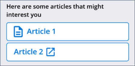
Attribute Format Description chatMessageArticleItemContainerHeight dimension Height of the KM Article Container chatMessageArticleItemBackground reference|color Background for the KM Article chatMessageArticleItemBackgroundColor color Background color for KM Article chatMessageArticleItemBackgroundBorderColor color Background Border color for KM Article chatMessageArticleItemTextColor color Color of the KM Article label text chatMessageArticleItemTextFontFamily string Font-family used for the KM Article label chatMessageArticleItemTextSize dimension Font size of the KM Article label chatMessageArticleItemUrlIcon reference Icon displayed after KM Article text chatMessageArticleItemTextIcon reference Icon used only with KM Articles with a preview. chatMessageArticleItemIconTint color Color of the Icon. KM articles preview
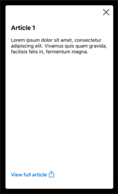
Attribute Format Description chatMessageArticlePreviewBackground Reference Background XML file for the KM Article Preview chatMessageArticlePreviewPadding Dimension Padding for the KM Article Preview chatMessageArticlePreviewCloseButtonSize Dimension Size for the close button chatMessageArticlePreviewCloseButtonIcon Reference Close button icon chatMessageArticlePreviewTitleTextSize Dimension KM Article title text size chatMessageArticlePreviewTitleTextFontFamily String Font size of the KM Article label chatMessageArticlePreviewBodyTextSize Dimension KM Article body text size chatMessageArticlePreviewBodyTextFontFamily String KM Article body text font chatMessageArticlePreviewTextColor Color KM Article body text color Action menu
Attribute Format Description chatMenuTextSize Dimension Font size for the menu text chatMenuTextColor Color Font Color for the menu text chatMenuTextFont String Font style for the menu text chatMenuBackgroundColor Color|Reference Background color used for the menu chatMenuBorderMargin Dimension Border margin used for the menu Chat Dialog
Attribute Format Description chatDialogBackgroundColor Color Background color used for the Dialog chatDialogHeaderBackgroundColor Color Background color for the header chatDialogTextSize Dimension Text size of the dialog message chatDialogTextColor Color Text color of the dialog message chatDialogTextFontFamily String Font family for the dialog message chatDialogButtonTextSize Dimension Text size of the dialog action buttons chatDialogButtonTextColor Color Text color of the dialog action buttons chatDialogButtonTextFontFamily String Font family of the dialog action buttons chatDialogTitleTextFontFamily String Font family of the dialog title text chatDialogTitleTextSize Dimension Text size of the dialog title chatDialogTitleTextColor Color Text color of the dialog title String customization
Strings.xml file in your project to override
the default values.<string name="chat_input_hint">Type a massage</string>
<string name="chat_typing_footer">%s is typing…</string>
<string name="chat_now">Just now</string>
<string name="chat_attachments">Attachments</string>
<string name="chat_send">Send</string>
<string name="chat_scroll_down">Scroll to latest message</string>
<string name="chat_new_message">New message</string>
<string name="chat_attachment_select">Select an action you want to perform</
string>
<string name="chat_attachment_incorrect_contenttype">Failed to upload - file
type not allowed.</string>
<string name="chat_attachment_incorrect_size">Failed to upload - Exceeded
max file size %s.</string>
<string name="chat_attachment_camera">Camera</string>
<string name="chat_attachment_gallery">Gallery</string>
<string name="chat_attachment_documents">Documents</string>
<string name="chat_attachment_preview">Attachment preview</string>
<string name="chat_item_description">%s • %s</string>
<string name="chat_item_delivered_status">Delivered</string>
Handling new messages when the chat is not active
com.pega.dm.mobile.chatsdk.intent intent, the system
broadcasts the NEW_MESSAGE_ACTION action for the
application package. The BroadcastReceiver register, for
example, can handle the new message for a proper action.class MyReceiver : BroadcastReceiver()
{
override fun onReceive(context: Context, intent: Intent)
{
val message = intent.newMessage()
/* Handle new message, e.g show notification */
}
} data class NewMessage(
val messageId: String,
val authorName: String,
val text: String,
val attachment: Attachment? = null
) {
data class Attachment(
val name: String,
val mimeType: String,
val size: Long
)
} Methods and callbacks
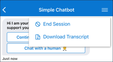
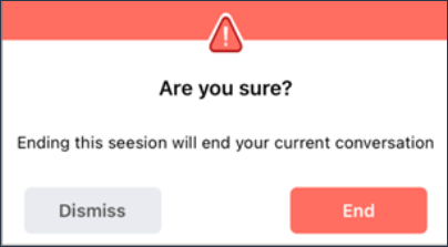
End session method
endSession () function is available in Chat Fragment or ChatView.

Calling from Chat Fragment

this. endSession ()

Calling from parent Activity

(supportFragmentManager.findFragmentById(R.id.chat_fragment) as ChatFragment). endSession ()

Or If you are using ChatView to initialize the SDK

(findViewById<ChatView>(R.id.chat)). endSession ()
Chat Transcript Method
downloadTranscript () function is available in Chat Fragment.

Calling from Chat Fragment:

this. downloadTranscript ()

Calling from parent Activity:

(supportFragmentManager.findFragmentById(R.id.chat_fragment) as ChatFragment). downloadTranscript ()

Or If you are using ChatView to initialize the SDK

(findViewById<ChatView>(R.id.chat)). downloadTranscript ()
Show menu
openMenu () function is available in Chat Fragment. If Menu is already presented, openMenu () will close the menu.

Calling from Chat Fragment:

this. openMenu ()

Calling from parent Activity:

(supportFragmentManager.findFragmentById(R.id.chat_fragment) as ChatFragment). openMenu ()

Or If you are using ChatView to initialize the SDK

(findViewById<ChatView>(R.id.chat)). openMenu ()
AuthTokenProvider Callback
override fun configuration() = ChatConfiguration(
    apiUrl = "…",
    apiId =”…”,
    customerToken = "…",

   // sessionIdCallback is optional
    sessionIdCallback = "...”

){apiService.getAuthToken()}


// Inside the ApiService

suspend fun getAuthToken() :String{
 	// Network call to request authToken

}

 Or


override fun configuration() = ChatConfiguration(
    apiUrl = "…",
    apiId =”…”,
    customerToken = "…",

   // sessionIdCallback is optional
    sessionIdCallback = "...”,

     authToken = apiService:: getAuthToken
)

// Inside the ApiService

suspend fun getAuthToken() :String{
 	// Network call to request authToken

}
Session ID Callback
override fun configuration() = ChatConfiguration(
    apiUrl = "…",
    apiId =”…”,
    customerToken = "…",
    authToken = “...”
   // sessionIdCallback is optional
    sessionIdCallback = apiService::onSessionIdReceived
)

fun onSessionIdReceived(id: String) {
 Log.d("Session ID", "Session ID received $id")
}
Previous topic Setting up Mobile Messaging SDK connection Next topic Mobile Messaging SDK configuration in your iOS app project