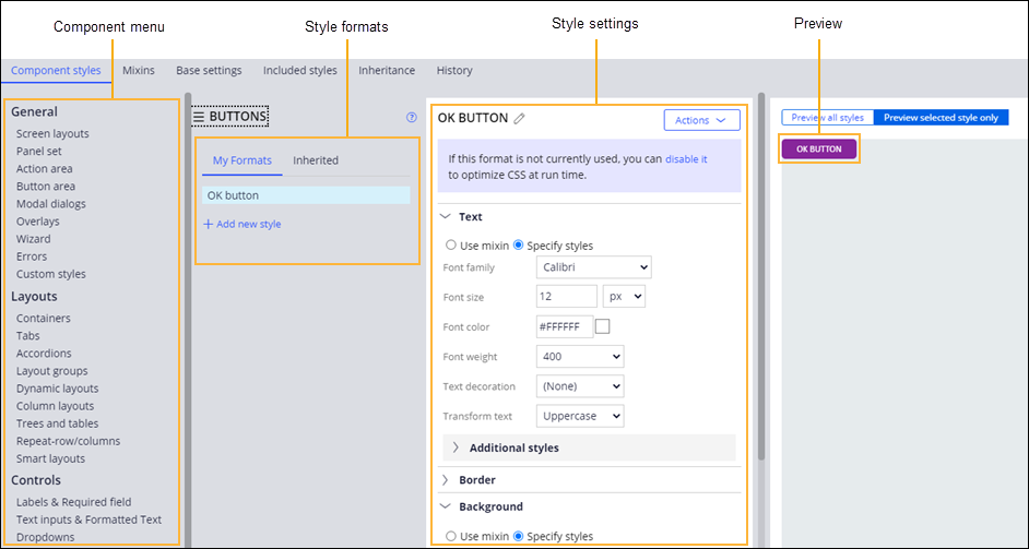
Component style formats
Component style formats help you customize the appearance of your user interface by storing information about the appearance of specific UI elements, such as layouts, error messages, or buttons. You can assign style formats to layouts or controls, and when you update the style format, the appearance of the associated UI element changes automatically.
For example, you can use the Strong style format on all the OK buttons in your application. If you decide to change the color of the button, you need to update only the Strong format, and the change spreads automatically to all the buttons that use it.
Style formats are grouped by the UI element that they define. The same component can have many style formats, and Pega Platform already includes a number of predefined formats that you can use in your application. While the out-of-the-box styles for different UI elements often share generic names, such as Strong, Standard, or Simple, each represents a different format that you must edit separately.
You can decide which formats to add to your skin, and remove the formats that you do not need. Removing or disabling unused formats helps improve performance by optimizing CSS at run time. If your application has many style formats of the same type that vary only slightly, you might also consider using CSS helper classes instead of creating custom style formats. Applying a CSS helper class saves development time, reduces maintenance work, and improves the consistency of the UI.
Figure: The Component styles tab in the skin editor