Configuring common field settings
Improve the presentation of your user interface by configuring out-of-the-box fields. By adjusting options such as visibility, helper text, or on-click behavior, you can adapt the controls to the needs of your business, and build a cleaner, more intuitive user experience.
The basic settings are shared by most fields and appear in different contexts throughout Pega Platform.

Configuring field behavior
Ensure that users complete the fields that are relevant to their case by defining the conditions that govern the fields' behavior. Depending on your business needs, you can mark fields as required, disable them under certain circumstances, or hide them completely.
For example, in a loan application, you can mark the fields that contain the name and address of the applicant as required. In this way, you ensure that the user who completes the form does not skip information that is crucial to process the case successfully.
- In the navigation pane of App Studio, click Case types, and then click the case type that you want to open.
- On the User interface tab, click the column-based view that you want to edit.
- In the Edit view section, click the Configure icon next to the field whose behavior you want to change.
- In the Edit field dialog box, in the
Conditions section, define the target behavior of the
field:
- In the Required list, specify whether the field must be completed by the user.
- In the Disable list, specify when the field is visible but not available to users.
- In the Visibility list, define when the form should display the field.
- In the Edit field dialog box, click Save.
Managing editing options for a field
Control the data in your application by defining the conditions in which users can input new information. You can configure a control to be fully editable, fully non-editable (read-only), or to switch to read-only mode under specific circumstances.
For example, when you create a new user account in an application, the text fields that contain the personal data of the customer are editable. During the next step, when the user has to confirm the data, you can configure the form to be read-only, and disable editing.
- In the navigation pane of App Studio, click Case types, and then click the case type that you want to open.
- On the User interface tab, click the column-based view that you want to edit.
- In the Edit view section, click the Configure icon next to the field whose behavior you want to change.
- In the Edit field dialog box, in the Edit
mode list, define the target behavior of the field:
- To copy edit settings from the parent view, select Auto.
- To disable editing, select Read-only.
- To disable editing under specific conditions, select Read-only (custom condition), and then click the Properties icon to define the logic in the condition builder.
- To disable editing based on a when rule, select When rule, and then in the Read-only when list, select the when rule that you want to use.
For more information on conditional logic, see Using conditional logic in Cosmos React and Creating a When rule. - In the Edit field dialog box, click Save.
Adding text to a field
Ensure that users fill in the forms in an application correctly by supplying brief instructions. By using labels, helper text, and placeholders, you define what kind of input goes into each control, which reduces the time that is required to fill in a form.
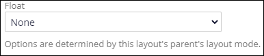
For example, a helper text might clarify differences in available options depending on the context:
You can define helper text for editable input fields, such as text areas or checkboxes. Helper text does not appear above fields that are in a read-only view or are not used for inputting data, such as paragraphs.
Text prompts are also important for accessibility, because they ensure that users who rely on assistive technologies receive reader-friendly guidance. Note the following accessibility best practices:
- Use only one method to label a field. For example, do not duplicate the content of the label in helper text.
- Use simple, clear language that is descriptive and does not include technical jargon.
- In the navigation pane of App Studio, click Case types, and then click the case type that you want to open.
- On the User interface tab, click the column-based view that you want to edit.
- In the Edit view section, click the Configure icon next to the field that you want to edit.
- In the Edit field dialog box, in the Field label field, enter the name that you want the application to display next to the field.
- In the Helper text field, specify the text that appears
below the field.
- In the Edit field dialog box, click Save.
Previous topic Configuring a data model for a case Next topic Configuring a Currency field