Configuring forms
Help users complete their work efficiently by configuring intuitive form views. For example, in a loan application, you can create a view with fields for collecting data about a secondary applicant and, when needed, reuse that view in different contexts throughout the application. By default, the system creates one form view for each step in the workflow.
You can find forms in the views pane on the User Interface tab of
a case or data object. 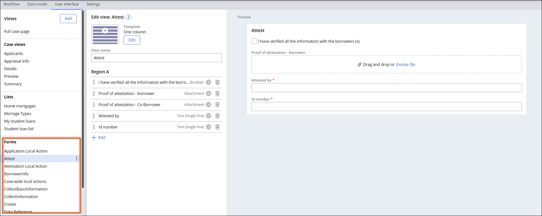
- In the navigation pane of App Studio, click Case types, and then click the case type that you want to open.
- Open the view that you want to configure:
Choices Actions Case On the User interface tab, in the Views pane on the left side of the window, click the form view that you want to edit. Data object - On the Data model tab, in the Options column, click the data object for which you want to create a view.
- On the User interface tab of the data object, in the Views pane on the left side of the screen, click the form view that you want to edit.
- In the Edit view section, define the layout for the
view:
- To change the view template, click Edit, and then click the template that you want to apply to the view.
- To change the name under which the view appears on the view list, in the View name field, enter a new view name.
- To display the view without a label at the top, clear the Display header checkbox.
- For the Default form template, define additional
template settings:
- To change the number of columns, in the Number of columns list, select the target value.
- To ensure that embedded views maintain their templates, in the Template for embedded view list, select Use template.
- In the Region section, define the content of the
view:
- To add a field, view, data relationship, or a UI component to the view, click Add, and then select the item that you want to add.
- To change the position of a field or a view on the page, drag the component into place.
- To remove a field or a view from the page, click Remove this field.
- In the row with the newly added item, click the
Configure icon, and then define additional settings,
such as labels and visibility.For more information, see Configuring fields.
- Click Save.
Previous topic Configuring list views Next topic Configuring fields