Out-of-the-box UI tools
Pega provides a variety of readily available tools for you to design a comprehensive and functional user interface for your application.
Anatomy of a UI
The following elements are the main constituents of your applications UI:
- Portals
- A portal is the chief interface of your application with which users
interact. Portals provide users with tools to complete the assignments
that are specific to their role, for example case workers or managers.
When you create a new application, Pega Platform
automatically generates the first portal for you.
For more information, see Configuring portals.
A sample application based on Theme Cosmos 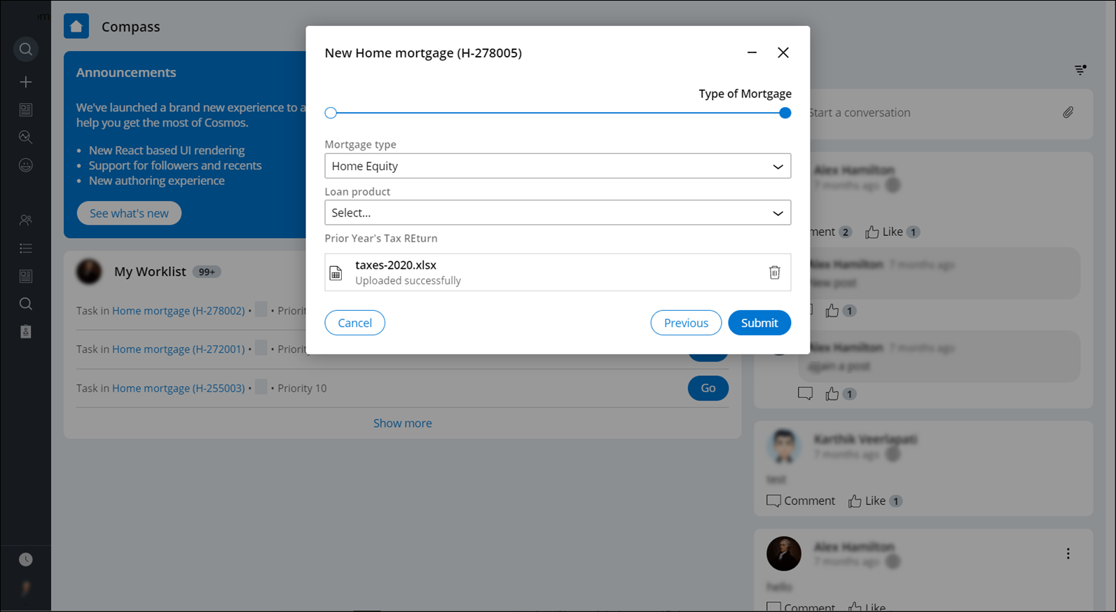
- Harnesses
- Harnesses organize the structure of portals and pages and define the
overall layout of the screen. The various areas of the screen are
represented by modular sections located in the harness.
For more information, see Harnesses.
- Sections
- Sections are the building blocks of your UI, which you can reuse in your
application for better consistency and lower maintenance. Sections use
templates that organize content into separate regions. Each region can
contain properties, labels, controls, and other sections.
For more information, see Sections.
- Design templates
- Design templates are reusable structural elements with predefined
components that you can use to configure portals, pages, and forms. By
applying design templates to sections, you promote consistency and
reduce maintenance because when you change a design template, all
sections that use that template are automatically updated. Design
templates cover many user interface scenarios, and require minimal
effort during upgrades.
Sample design template options 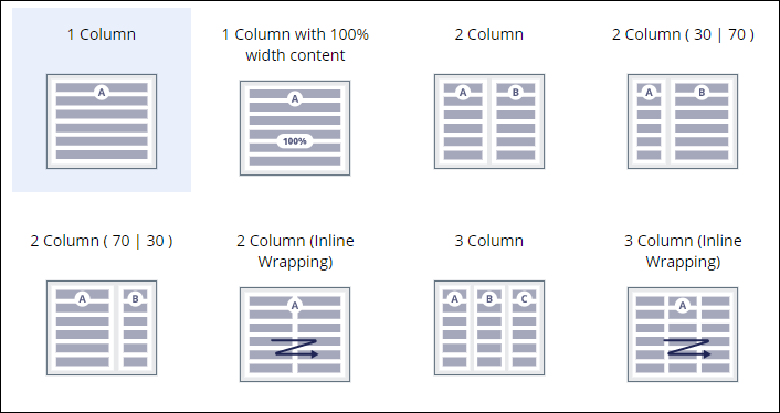
For more information, see Design templates.
- Forms
- Forms represents various steps in case processing. A typical example is
a form that collects the personal information of a user who submits a
service request.
Forms contain fields for collecting information, which are the run-time representations of some controls, for example, text input, phone, or email. Other controls help users perform actions in forms, for example, buttons or check boxes. Forms are also made of views. For more information, see Forms and views.
- Controls
- Controls introduce interaction to your interface with such elements as
buttons, links, and fields, through which users initiate certain events,
such as displaying a screen, saving their work, or advancing a work
item.
Sample picker controls 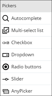
For more information, see UI components in a view.
Accessibility
UI components in Pega Platform support assistive technologies for a more inclusive approach to users with disabilities. Accessibility features take advantage of ARIA roles that provide additional information about your application to assistive technologies such as screen readers.
For more information, see Configuring an accessible UI.
Localization
Localization helps you broaden your pool of application users by setting the product in an understandable context. You can also use a wizard to automate localization processes, for example, the preparation of translation packages.
For more information, see Localizing your application.
Previous topic Learning about core user interface principles Next topic Future-proof UI design