Working with App Studio forms
Use App Studio to customize the out-of-the-box forms that capture user input in cases, and achieve quick results with minimal effort. When you organize the fields in a form, you can clearly communicate to users what tasks they need to perform to process an assignment in a case.
You can use a range of low-code tools to personalize forms and organize them to meet your needs. For example, you can decide on the tabs in your case summary pane or the information in the details section. Customizable controls, with which you can enrich forms, offer modern and dynamic interaction to your users. Fields help users populate forms quickly and intuitively. By managing the data sources in controls and fields, you ensure a solid and streamlined experience for all users of your applications.
Discover more about adjusting default forms in the following articles:
- Forms and views
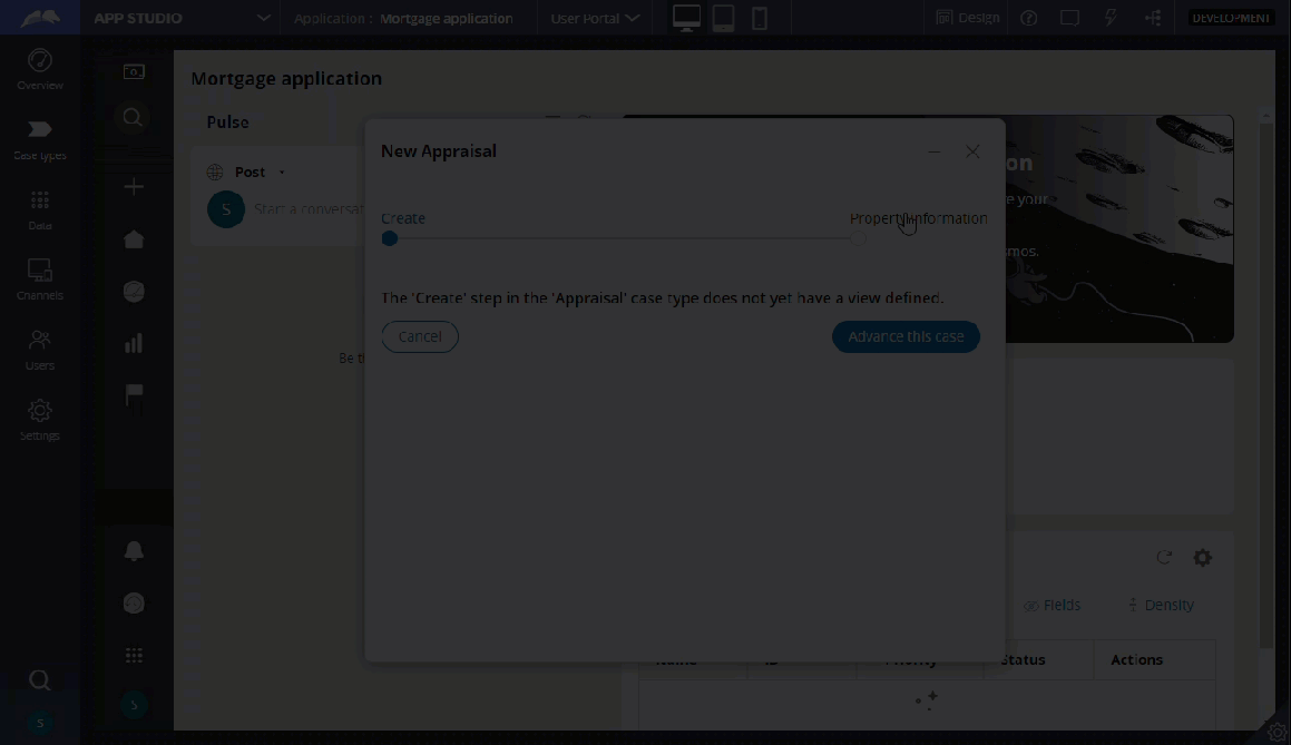
Forms and views enable your application to display and collect information, for example, to fulfill requests or process cases. By setting up intuitive forms and views, you help users process their work with less effort.
- Accessing views in your application
Manage the appearance and behavior of your app by accessing and editing views. Views are reusable clusters of UI components that contain elements such as text fields, check boxes, radio buttons, or other views. By editing views, you can define what your application looks like, determine the functions of each UI area, and provide useful information to your users.
- Organizing your view
Give your view a consistent structure by using design templates. Design templates represent common user interface patterns and specify regions in which you add user interface elements, such as fields, actionable elements, and reusable components.
- UI components in a view
Users complete work by interacting with components such as text fields or pickers. In Pega Platform, you can add these elements to your application by configuring out-of-the-box controls or embedding existing fields and views in the UI. This mixed approach helps you build an intuitive, modular UI that is easy to use and convenient to update and maintain.
- Case views
A view is a reusable configuration of UI elements that you can use to build a modular, consistent, and intuitive work space with less effort. When users work on a case, they interact with case views to gain insight into the case and perform their tasks.
- Sources of data for your UI
You can automate the sourcing of content for tables and picker controls by defining sources for the values that populate the tables and controls at run time. For example, in a delivery form, you can configure a radio button control group to display the values from the D_CustomerDeliveryAddresses data page so that the customer can choose the most convenient option for a particular order.
Previous topic Adding, editing, and deleting a preview device Next topic Forms and views