Working with Dev Studio forms
Forms capture information that your application needs to process cases. By configuring intuitive forms in Dev Studio, you can help your users understand the tasks that they need to perform.
When you design your application by using App Studio, you can use a number of low-code tools to build versatile, out-of-the-box forms. If your application requires a unique component, you can build it manually in Dev Studio. Dev Studio forms are more flexible and customizable, but require more effort to build, maintain, and upgrade. Harnesses, sections, and layouts are the building blocks of such custom forms.
Discover more about customizing forms in the following articles:
- Modular design in Dev Studio
A well-designed interface helps users interact with your application. By applying the principles of modular design to your portals, you can create optimal work environments with greater flexibility and less effort.
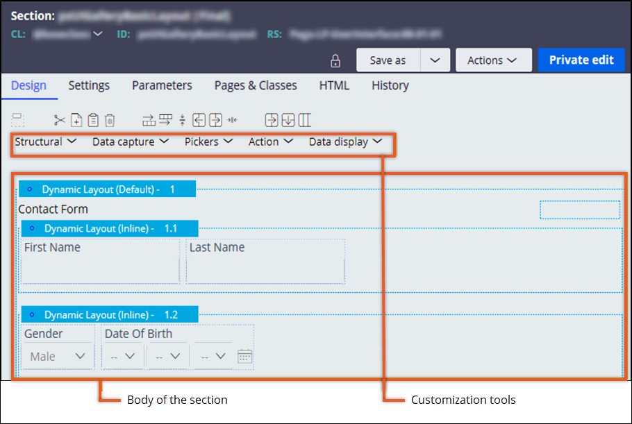
- Harnesses
Harnesses organize the content and structure of a portal. You can populate harnesses with sections to build a modular interface that promotes reuse and maintainability.
- Layouts
Layouts help you organize UI elements on the screen and determine the overall presentation of your portal.
- Sections
Sections are the building blocks of your user interface. You can populate a section with UI elements, such as fields and controls, to create a functional chunk of user interface that can be reused in different contexts for improved consistency and efficient development.
- Design templates
Design templates are reusable patterns that provide form and function for your user interface. Each template includes predefined areas to which you can add application content. By applying design templates to UI sections, you achieve consistency across your application, shorten development time, and reduce maintenance efforts.
- Referencing data
Applications and their users need data to process cases and make informed decisions. Apart from the information provided by users during the case lifecycle, your application might also require access to existing records. Referencing data helps your users interact with data resources, and improves the efficiency of data collection.
- Deferred loading of content
To accelerate the loading of the main content on a web page, you can defer the loading of the secondary content. Web pages with shorter response times enhance the user experience and productivity in an application.
- Modal dialog box
Modal dialog boxes help users focus on a specific task. Because users cannot continue in the application without processing or dismissing the modal dialog box, the modal dialog box also might provide you with tools to highlight required fields and actions.
- Adding a chart
Increase the readability of your application by presenting data as appealing charts. For example, in a sales application, you can include a pie chart showing the revenue of your company to enhance the process of data analysis.
- Creating custom menus
Build custom navigation to ensure that your users can more conveniently move between different parts and features of your application. By pairing the Menu control with a navigation rule, you can set up a navigation scheme that meets the requirements of your business.
- Creating UI subscription channels
Provide a way to notify the client about changes on the server without having to explicitly refresh the application, by setting up UI subscription channels.
- Adding a video to your UI
Supplement your interface with additional materials by adding a video to your application. By using videos, you can provide user guidance or create a richer and immersive experience.
- Accessing the UI Gallery
Explore sample, guardrail-compliant design patterns that have been built by using the various features and layouts of Pega Platform.
- Reusing UI Gallery examples in an application
Accelerate application development with ready-to-use components from the UI Gallery landing page.
- Supported display modes by field type
The following table lists the display modes that are supported by each field type. You select a display mode when you add a single-value field to a form. By default, all fields have a display mode set to Optional.
Previous topic Specifying a data source directly in a property Next topic Modular design in Dev Studio