User Interface Overview (6.1 SP2)
A positive user experience is critical to the success of your project. A well-designed interface lets managers and users realize the performance that your PRPC application was built to deliver. In short, a good application UI provides:
- The right functionality
- At the right time
- To the right people
With rule-based technology and proven methodology, your team can quickly build a consistent and rich application UI that is right the first time and has the flexibility to easily adapt to changing needs.
What is the PRPC user interface? | Key Features & Attributes | Terminology
What is the PRPC user interface?
The PRPC user interface consists of:
- Work forms — Contain the information and controls that an application user needs to enter and process work items.
- Portals — Workspaces that support users and managers as they create, update, route, and resolve work items.
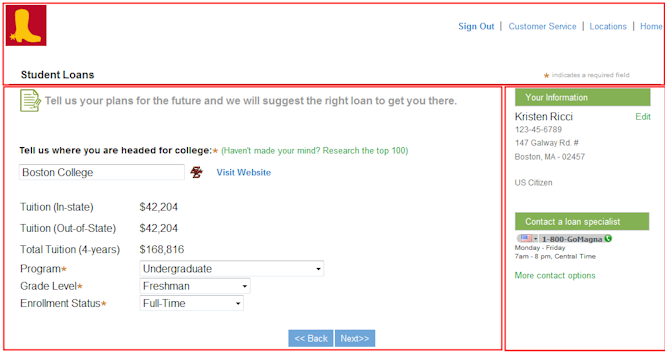
About work forms
Below is an example of a work form in which a user enters the items for a purchase order request:
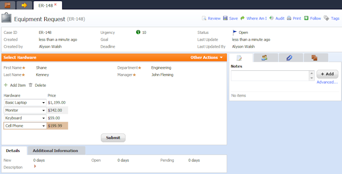
The form contains:
- Information collected earlier in the process (creation date, entry operator).
- Fields for manually entering information (hardware items) and Add and Delete icons for controlling the form content. The system automatically enters the price for each item and calculates the total.
- An area for submitting an action within the current assignment, such as attaching an email or adding a note.
- A Submit button for updating and routing the work item to the next process step and the option to select another action (Other Actions).
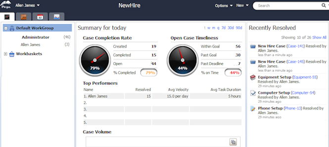
About portals
PRPC includes a Case Manager and a Case Worker portal, which are designed to suit each role. Your team can customize these two portals or build new portals to reflect the terminology, layout, facilities, and styles appropriate to your user community. You can use auto-generated dynamic containers to present work items and worklists as single or multiple documents (harnesses or sections) as tabs in your portal. Here is an example of a standard manager portal:
UI building blocks
Work item forms and portals are built from harness rules. As a designer, you employ user interface rules and other design elements to design the harness. Rule types include sections, harness, controls, and so on. During development, you reference rules in other categories such as properties, field values, text files, reports, and models to complete your user interface. You use other elements, which are not rules, to design the form's appearance. These include layouts, containers, and panel sets.
Assembling a form
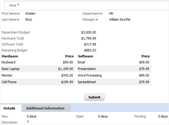
Here is an example of a work form for a new equipment purchase request as it appears to a user at runtime:
Below is the same form as it appears to the designer. Controls are used in Layouts, which are contained within Sections. A section can be included in another section, a layout, or a cell, enabling re-use throughout your application. Some of the UI rules and design elements are shown here:
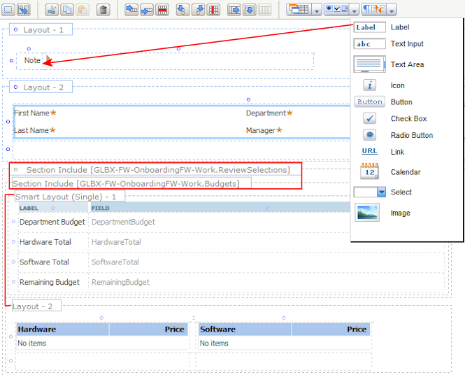
The designer used the following to build this form:
- Sections — Work information and functionality are grouped into sections by context and purpose. Each section can be included in other sections so that the developer can reuse them in a variety of contexts. The designer also uses sections when designing flow actions that require additional fields or forms needed to complete an assignment.
- Layouts — Layouts organize properties and controls within a section. Layout cells contain properties, labels, controls, or other sections. There are various types of layouts that dictate how cells are arrayed. The designer used a SmartLayout that ensures consistent spacing of horizontal elements. Layouts can be automatically converted into a sections so that they can be reused in other harnesses, sections, or flow actions.
- Controls — Information about a work item is entered or displayed in controls such as text areas, drop-down lists, checkboxes, or calendars. Many of these controls are configured so that they meet, without further refinement, most of your process requirements. To add a control, the designer simply drags and drops it from a drop-down menu onto a layout cell. The red arrow in the above example indicates how a label was placed in a cell. The designer uses similar menus for adding layouts, containers, and sections to the form.
Portals and panels
The designer uses the rules and elements mentioned above when developing a portal. A panel set in the portal harness defines its overall structure. The set includes bottom, top, left, right, and center panels. Panels are not rules — they reference section rules. The following is an example of a loan application using the Header Right Column panel set, comprised of top, center and right panels: 
To create a new portal, a designer drags and drops a pre-configured panel set from a menu onto the harness. PRPC includes more than a dozen sets to choose from. To change an existing portal design, a designer can select another panel set and drop it onto the harness. The system reconfigures the harness layout automatically.
Tools for productivity
PRPC includes a variety of tools and functions that accelerate interface development. They enable the designer to:
- Add controls and other design elements by selecting an icon from a menu and dropping it onto a form.
- Move or copy elements such as cells, layouts, or sections using mouse selections or copy/paste commands.
- Drag and drop sections and properties from the Application Explorer onto harnesses, flow actions, or sections.
- Design an application skin that reflects corporate or departmental standards using the Skin rule.
Key features and attributes
A PRPC user interface ensures:
- Reusability and specialization — The user interface is entirely rule based. The PRPC class structure offers design flexibility and provides for many levels of reuse. For example, you place shared UI rules, such as harnesses, at a generalized application class level while enabling customization of sections and controls at specialized or organizational levels.
- Uniform branding — The Skin rule eliminates the need to directly edit CSS files and ensures that UI branding is consistent throughout your organization.
- Automatic HTML generation — When you save section, control, harness, and flow action rules, PRPC uses the information on the form to automatically generate the necessary HTML, styles, and JavaScript. Auto-generation eliminates most hand-coding, reduces scripting (XSS) vulnerabilities, and ensures browser independence and compatibility.
- Localization — User-visible field values can be localized using language-specific RuleSets and present your application in any of a number of languages. The fundamentals of your application — flows, activities, properties, and so on — operate the same, regardless of language.
- Accessibility — A separately licensed RuleSet helps you provide an application that a user with disabilities can operate effectively and productively.
- Web access — The Internet Application Composer (IAC) feature enables you to embed a PRPC application as a gadget on the pages of an existing Web application located on your intranet, extranet, or internet site.
Important terminology
Control — Control rules dictate how properties appear on work item forms, correspondence, and other HTML forms for both display and for accepting user input. When working in section, harness, or flow action rules, you can drag and drop controls from a group of icons directly onto the layout.
Flow Action — A flow action rule dictates how users interact with work item forms to complete assignments. After selecting one flow action, users may fill in a section of the form to complete (perform) the assignment. To define their content, the flow action references a section or sections that contain the form fields the user is to complete.
There are two types of flow actions:
-
Connector — Complete the assignment and advance the work object to the next task. The work item is removed from the user's worklist.
-
Local — Keep the assignment open and on the current user's worklist.
Modal dialog — presents a flow action as a pop-up window, which is displayed on top of the work form. Typically, the user cannot continue with other work until the dialog is completed or dismissed.
Harness — A harness rule defines the appearance and behavior of:
- Work forms — For reviewing, entering, and updating work items.
- Portals — For creating, updating, routing, and resolving work items.
Portal — User portals support managers and users of applications as they create, update, route, and resolve work items. A portal is defined by a collection of harness rules that reference a panel set. Each harness rule defines a space, which is the entire portal window. An access group references one or more portal rules.
Repeating Layout — Three types of repeating layouts allow users to view or edit values in a table or tree form. Each type dynamically generates the rows or branches needed to display the requested data.
- Grid — The values appear in a spreadsheet format.
- Tree — The values appear in a tree structure. The user can click branches to display or hide their leaves. The tree can display embedded relationships as deep as twenty levels.
- Tree Grid — The values display in a structure that combines the navigation benefits of a tree with a spreadsheet's access to data.
Section — A rule that defines a portion or area that logically groups layouts, controls, and other functions in a harness or flow action form. Sections may contain other sections.
Skin — Referenced by a portal rule, a Skin rule defines the Cascading Style Sheet (CSS) that determines the colors, fonts, images, and layout of portal, work object, rule forms, and report displays.
SmartLayout — A layout grid of paired cells on a harness, section, or flow action form that has columns of uniform width, uniform styles, and uniform characteristics. Each pair of cells holds one label and one property value or other form control. A primary benefit of SmartLayouts it to force vertical alignment even when layouts are nested.
Work form — An HTML form, defined by a harness rule, that supports application users as they enter, review, update, and resolve work objects. You define work item forms using harness and section rules.