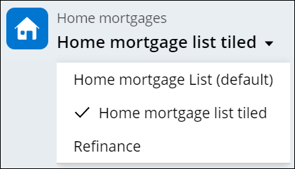
Configuring lists
Help users access and compare data with lists. Use tables and tile galleries in your applications as a flexible basis for users to process large amounts of information. For example, tables in a price comparison application can help users efficiently identify the best offer.
You can also configure views to support editing, sorting, and custom presentation options.- In the navigation pane of App Studio, click Case types, and then click the case type that you want to open.
- On the User interface tab, click the list that you want to edit.
- In the Data page field, select the data page from which you want to source the list contents.
- In the Display name field, enter the name for the view,
and then define how you want to present the data to the user:
Choices Actions Table In the Template list, select Table. Tile-based gallery - In the Template list, select Gallery.
- In the Card header list, select the field that you want to use as the header for your tile.
- In the Secondary text field, select the field that you want to use as the source of additional text on your tile.
- In the Columns section, add the columns that you want to include in the view by clicking Add, and then select the field that you want to associate with the column.
- In the Column to take up remaining width, define which column stretches to fill free space in your table.
- Optional: To define what data is displayed in the table, set one or more filters:
- In the Filter by list, select Custom, and then click the Properties icon.
- In the Condition Builder window, define the
expression that you want to use to filter the table contents.For more information, see Using conditional logic in Cosmos React.
- In the Sort by list, add the property by which you want sort the list by clicking Add, and then select the field that you want to use as a filter.
- In the list that appears next to the property field, select the order in which you want to sort the table.
- Optional: To group the table contents by a property, in the Group by list, add the property by which you want group the table by clicking Add, and then selecting the target field.
- Optional: To define additional table behavior, in the User Personalization section, select the check boxes for the features that you want to use.
- Optional: To add a new view to the list, under the data source list, next to the Default view tab, click Add, and then repeat steps 4 to 11.
- Click Save.
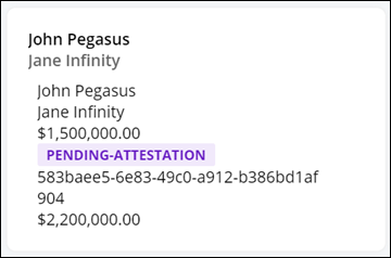
If you configure your view as a gallery, the UI displays list entries as tiles. The following image represents a sample gallery tile:
Previous topic Configuring column views Next topic Configuring tabs