Out-of-the-box user interface capabilities
Pega provides a variety of readily available tools for you to design a comprehensive and functional user interface for your application.
You can create effective interfaces for your application with out-of-the-box elements from the following categories:
Structural components
The following elements govern the structure of forms, pages, and entire portals:
- Design templates
- Design templates are reusable sections with predefined elements that you
can use to build your interface. You can apply design templates to
sections to promote consistency, and to ensure that all sections are
up-to-date when you alter the template. Design templates cover many user
interface scenarios, and require minimal effort during upgrades.
Sample design pattern options 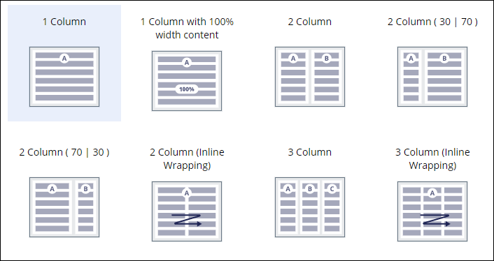
For more information, see Design templates.
- Layouts
- Layouts form the structure of your interface by being containers for
other components, such as fields and buttons. In Dev Studio, you can use layouts to build your own
design templates and other custom UI elements. This solution offers more
flexibility, but requires more maintenance and development effort during
migration to Cosmos React UI.
Sample inline grid layout 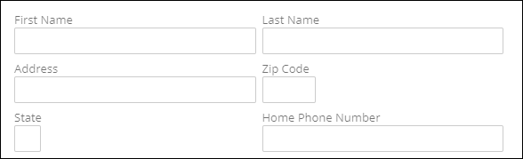
For more information, see Layouts.
Presentational components
The following components govern the appearance and style of your interface:
- Skins
- Skins are rules that help you define the style of your interface and the
presentation of your content. You can determine the typography, borders,
backgrounds, placement, and appearance of UI elements. Skins separate
content from its presentation, so that you can reuse your configurations and
keep user interface design consistent throughout your application.
Sample skin with action area settings 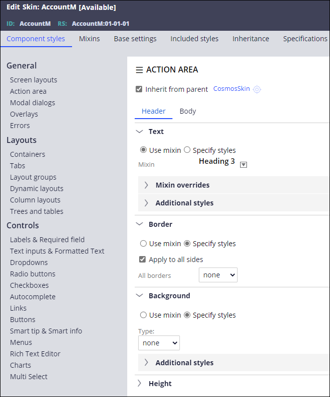
For more information, see Skins.
- Cascading Style Sheet (CSS) helper classes
- CSS helper classes are predefined classes that help you make minor changes
in the format of layouts. For example, you can change the borders, margins,
or padding.
For more information, see CSS helper classes.
Behavioral components (Action sets)
Action sets can help you create a dynamic UI in which certain elements appear only under certain conditions. For example, when the user selects their marital status as married, a new section is displayed that collects information about the partner. Action sets consist of the following elements:
- Event
- User activity that triggers actions. For example, selecting a check box.
- Action
- System response to an event. For example, displaying a new section.
- Conditions (optional)
- Restrictions that apply to combinations of events and actions. For
example, hovering over a field and displaying a message if the field is
empty.
A sample configuration of an action (showing a smart tip) for an event (hover) 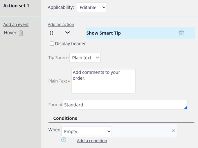
For more information, see Using business logic to drive user experience.
Actionable elements (Controls)
Controls introduce interaction to your interface with such elements as buttons,
links, and fields, through which users initiate certain events, such as displaying a
screen, saving their work, or advancing a work item.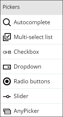
For more information, see Controls.
Accessibility
UI components in Pega Platform support assistive technologies for a more inclusive approach to users with disabilities. Accessibility features take advantage of ARIA roles that provide additional information about your application to assistive technologies such as screen readers.
For more information, see Building an accessible UI.
Localization
Localization helps you broaden your pool of application users by setting the product in an understandable context. You can also use a wizard to automate localization processes, for example, the preparation of translation packages.
For more information, see Localizing your application.
Previous topic Client-side templates Next topic Designing a future-proof UI